Cardiff food company forced to defend ‘inappropriate’ logo
By Josh Haggis
A Cardiff-based food company has been forced to defend its logo after some customers labelled it inappropriate.
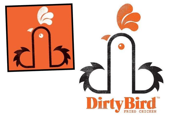
Dirty Bird, a food truck that serves up fried chicken at festivals and events throughout Wales, has been criticised for using a logo featuring a cockerel – which some patrons believe bares a resemblance to a certain part of the male anatomy.
After receiving complaints from customers, Dirty Bird have insisted that any similarity is coincidental and very much in the eye of the individual.
“We were given the name Dirty Bird as the brief, and started working on ideas,” explained the logo’s designer, Mark James. “We looked at the initials, DB. Then worked with the lowercase ‘db’ linking them to form the shape of a rooster. It’s graphic representation of a rooster incorporating the initials. It depends on how you look at it.”
Take a look at the logo below:

One of the food van’s recent customers, Denise Leyshon, 43, told WalesOnline that she was surprised by the logo, but enjoyed the chicken meal she purchased at Dirty Bird nonetheless.
“The food was finger-licking good but when I saw the logo I was a bit shocked. It’s not really what you want to think about when you’re tucking into your meal,” she said, before adding: “I was a little shocked but I would still come back for seconds.”
Meanwhile, earlier this year a Swedish company was forced to defend its ‘X-pop’ lolly from similar complaints relating to its supposedly inappropriate shape. Read more here.